Thread, Pantone & Colour Matching
Pantone colour matching converts your brand's PMS code into the closest available thread or material colour on a custom patch. UK businesses use this process to keep their patches consistent with brand guidelines across uniforms, workwear, and merchandise. This page explains how thread, Pantone, and colour matching work together, how accurate the result is, and how to brief your colours correctly before you order.
What Is Pantone Colour Matching for Patches?
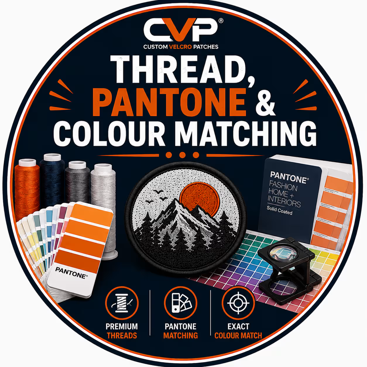
Pantone colour matching is the process of translating a Pantone Matching System (PMS) reference into a physical patch colour. The Pantone Matching System assigns every colour a standardised code, such as PMS 485 C, which removes the guesswork from describing a shade. A patch maker reads that code and selects the nearest thread, twill, or material colour to reproduce it.
The PMS code acts as a single source of truth for your brand. A logo described as "red" can mean hundreds of different shades, but a logo specified as Pantone 186 C means one exact value worldwide. Custom patches rely on this precision because a patch carries your identity onto a garment, and brand recognition depends on consistent colour. When you supply a Pantone Coated code, you give the production team an unambiguous target to match.
Two Pantone libraries matter for patches. Pantone Coated (the "C" suffix) reproduces colours on coated stock and suits most logo work, while Pantone Uncoated ("U") shifts slightly softer. Embroidery, woven, and PVC patches reference the Coated library by default, so a Coated code is the cleanest brief you can give. With the code confirmed, the next stage is the matching process itself.
How We Match Your Pantone Colour to Patch Thread
We match your Pantone colour to patch thread in three steps. The process moves from your brand specification to an approved digital proof, and each step reduces the risk of a colour surprise. Follow this sequence to lock your colours before production starts.
Supply your Pantone (PMS) code or brand guide.
Send us your Pantone Coated codes, your brand guidelines, a hex or CMYK value, or a physical sample. Any of these gives our team a defined colour standard to work from. A Pantone code produces the most accurate brief, but a brand guide or sample works well too.
We cross-reference against our thread chart.
Our team compares your Pantone reference against a professional thread chart, such as Madeira or Isacord, and selects the closest stitched colour. Thread manufacturers license many Pantone matches directly, which speeds up this conversion and improves accuracy. Where a colour sits between two threads, our digitising team chooses the nearest match and notes any visible difference.
You approve the digital proof.
We send a digital proof showing your colours mapped onto the patch design. You review the thread, twill, and border colours, request changes, and approve the final artwork. Production begins only after you sign off the proof, so the colours you see are the colours you receive. You can review the full process on our digital proof approval page.
This three-step method gives you control at every stage. The proof stage matters most, because it shows how a flat Pantone code behaves once it becomes physical thread. To understand why that difference exists, you need to know how thread colour and ink colour are made.
Why Thread Colour Differs from Pantone Ink
Thread colour differs from Pantone ink because the two are made from different materials. Pantone defines colour as printed ink on paper, while a patch reproduces colour as dyed fibre, moulded PVC, or printed fabric. Ink and dyed thread reflect light differently, so the same Pantone code looks slightly different in thread than it does on a printed swatch. This is a physical property of the materials, not an error in production.
Three factors create the gap between a Pantone reference and a finished patch. First, the palette is limited: the Pantone Matching System holds more than 1,800 solid colours, while a typical embroidery thread range offers around 300 to 400 shades. A patch maker selects the closest available thread rather than mixing a custom dye for every order. Second, texture changes perception, because thread is a raised, woven surface that scatters light, whereas ink lies flat. Third, sheen affects the result, since polyester thread carries a slight gloss that rayon and matte fabrics do not.
Lighting changes everything about how you read a colour. A patch viewed under warm indoor light looks different from the same patch under daylight, so the embroidery industry standardises colour viewing under cool white fluorescent lighting at 4100°K. When you assess your digital proof or a stitched sample, judge it under neutral light to match the production standard. Understanding this material reality sets a realistic expectation for accuracy, which is the question most buyers ask next.
How Accurate Is Pantone-to-Thread Matching?
Pantone-to-thread matching reaches roughly 95–99% accuracy on most colours. The result is a closest available match rather than a guaranteed identical shade, because thread palettes cannot replicate every Pantone reference exactly. For the vast majority of brand colours, the difference is invisible to the eye and the patch reads as a faithful reproduction of your logo.
Colour scientists measure the gap between two colours as Delta E. A Delta E under 2.0 means the human eye perceives the colours as effectively the same, while a higher value signals a visible difference. When your Pantone code falls within a tight Delta E of an available thread, the match is excellent. When it sits outside that range, our team flags the variance on your digital proof so you decide with full information.
Some colours match more easily than others. Standard brand colours, such as navy, red, and royal blue, have direct thread equivalents and match almost perfectly. Fluorescent, metallic, and pastel shades are harder, because dyed fibre cannot always achieve the brightness or subtlety of printed ink. Where an exact match does not exist in stock thread, we offer the closest shade, recommend a stitched sample, or source a specialist thread on request. This honest approach protects your brand and removes the guesswork from your order.
| Colour type | Match accuracy | Notes |
|---|---|---|
| Standard brand colours (navy, red, royal) | Excellent | Direct thread equivalents available |
| Corporate mid-tones | Very good | Closest match within tight Delta E |
| Pastels | Good | Limited soft shades in thread palettes |
| Fluorescent / neon | Variable | Brightness limited by dyed fibre |
| Metallic (gold, silver) | Specialist | Requires metallic thread, available on request |
The accuracy you achieve depends partly on the patch type you choose, because each material reproduces colour in its own way.
Colour Matching Across Patch Types
Colour matching behaves differently across patch types because each type uses a different material to carry colour. Embroidered patches reproduce colour through dyed thread, woven patches through fine yarn, PVC patches through moulded rubber, and printed patches through ink. Choosing the right patch type for your design is the first decision that shapes your colour result.

Embroidered Patches - Thread Colour Matching
Embroidered patches match colour through dyed thread, with each colour stitched as a separate thread. This method suits bold, solid-colour logos and produces a classic raised texture. Most embroidered orders include a set number of thread colours, and our team matches each one to your Pantone reference. Designs with sharp gradients or fine photographic detail suit a different patch type, because thread renders flat blocks of colour rather than blends. You can explore the full range on our embroidered patches page.
Woven Patches - Fine Thread Density & Colour
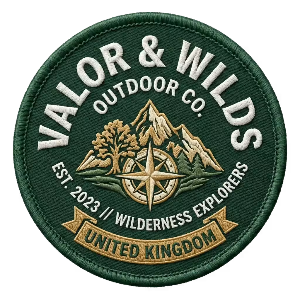
Woven patches match colour through fine yarn woven at high density. The thinner thread produces sharper detail than embroidery, which makes woven patches ideal for small text and intricate logos. Colour matching follows the same Pantone-to-thread principle as embroidery, though the finer weave reproduces detailed colour boundaries more crisply. See our woven patches page for detail-heavy designs.

PVC Patches - Mould Colour Matching
PVC patches match colour through pigmented rubber poured into a mould. Each colour is mixed as a separate PVC pour, which allows accurate, solid, hard-wearing colour blocks. PVC reproduces Pantone colours consistently because the pigment is mixed rather than selected from a fixed thread palette. This material suits outdoor, tactical, and military patches that need waterproof, colour-fast durability. Our PVC patches page covers mould options.

Printed & Sublimation Patches
Printed and sublimation patches match colour through CMYK ink printed onto fabric. This method reproduces unlimited colours, gradients, and photographic detail, so it handles complex artwork that thread cannot. Printed patches convert your Pantone code into a CMYK ink value, which makes them the most accurate choice for multi-colour and gradient designs. Browse our printed patches page for full-colour work.
The patch type sets the colour method, but the backing fabric behind your design also affects the colours you see.
How Backing Twill Affects Your Colours
Backing twill affects your colours because the twill fabric shows through any area a design does not fully cover. Twill is the woven base fabric of an embroidered patch, and it sits behind the stitched thread. A patch with full thread coverage hides the twill completely, while a patch with partial embroidery reveals the twill colour as part of the design.
The twill colour functions as a design element, not just a background. A navy logo stitched onto white twill reads very differently from the same logo stitched onto black twill, because the exposed fabric frames every stitched area. When you brief your colours, you choose your twill colour alongside your thread colours so the two work together. Our team confirms both on your digital proof.
Twill choice also affects contrast and legibility. Light thread on dark twill stands out sharply, while similar tones of thread and twill reduce definition. For logos with fine detail or small text, we recommend a strong contrast between thread and twill so the design stays crisp. With your patch type, thread colours, and twill confirmed, the final step is briefing your colours correctly.
How to Brief Your Colours Correctly
You brief your colours correctly by giving our team a defined colour standard before production. A clear brief removes ambiguity, speeds up your digital proof, and protects your brand colours from the start. Supply the most precise reference you have, and add context where colour accuracy is critical.
- Send Pantone Coated (C) codes. A Pantone Coated reference, such as PMS 200 C, gives the most accurate brief and matches the library patch production uses by default.
- Provide your brand guidelines. A brand guide lists your approved colours and keeps every patch consistent with your other branded items.
- Include a hex or CMYK value if you have no Pantone code. These digital values give our team a usable target, and we convert them to the closest thread or material colour.
- Supply a physical sample for exact matches. If you need a patch to match an existing item, send a sample so we can match it directly under standard lighting.
- Specify your twill colour. Choose your backing fabric colour alongside your thread colours, because exposed twill forms part of the finished look.
- Flag your priority colours. Tell us which colour matters most so we prioritise that match if a compromise is ever needed.
You can prepare your files and colour references using our artwork and colour briefing guidelines. A complete brief leads straight to an accurate digital proof, which answers most of the questions buyers ask about colour matching.
Our Customer Reviews
Frequently Asked Questions
Can you match my exact Pantone colour on an embroidered patch?
Do I need a Pantone code to order a custom patch?
Will my patch colours look the same under different lighting?
Does the backing twill colour affect my design?
Which patch type gives the most accurate colour match?
Summary
Accurate colour is what makes a custom patch represent your brand correctly, and Pantone matching is the system that delivers it. Your PMS code becomes a physical patch colour through a defined three-step process: you supply the reference, we match it against a professional thread chart, and you approve a digital proof before anything is produced. Because thread, rubber, and ink each carry colour differently from printed Pantone ink, the result is a precise closest match rather than an identical clone, with most brand colours reproducing faithfully to the eye. Choose the patch type that suits your design, confirm your twill colour, and supply a clear Pantone brief, and your finished patches will carry your brand colours consistently. Request a quote with your Pantone codes to start your order.